-
-
-
Tổng tiền thanh toán:
-
-
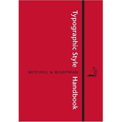
Typographic Style Handbook: A Guide to Typography from Libanus Press
An elegant handbook in typography, for the prof...
59.000₫
-
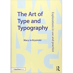
The Art of Type and Typography: Explorations in Use and Practice
The Art of Type and Typography is an intro...
59.000₫
-
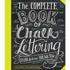
The Complete Book of Chalk Lettering: Create and Develop Your Own Style
Ubiquitous at boutiques and cafés, on Etsy and ...
59.000₫
-
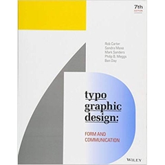
Typographic Design: Form and Communication
The bestselling introduction to designing the w...
59.000₫


-
Thông tin
-
Tìm sách theo yêu cầu
To the layman, all printing types look the same. But for typographers, graphic artists and others of that lunatic fringe who believe that the letters we look at daily (and take entirely for granted) are of profound importance, the question of how letters are formed, what shape they assume, and how they have evolved remains one of passionate and continuing concern.
Lawson explores the vast territory of types, their development and uses, their antecedents and offspring, with precision, insight, and clarity. Written for the layman but containing exhaustive research, drawings and synopses of typefaces, this book is an essential addition to the library of anyone s typographic library. It is, as Lawson states, not written for the printer convinced that there are already too many typefaces, but rather for that curious part of the population that believes the opposite; that the subtleties of refinement as applies to roman and cursive letters have yet to be fully investigated and that the production of the perfect typeface remains a goal to be as much desired by present as by future type designers. Anyone aspiring to typographic wisdom should own and treasure this classic.
- Link: http://www.amazon.com/Anatomy-Typeface-Alexander-S-Lawson/dp/0879233338
Lawson explores the vast territory of types, their development and uses, their antecedents and offspring, with precision, insight, and clarity. Written for the layman but containing exhaustive research, drawings and synopses of typefaces, this book is an essential addition to the library of anyone s typographic library. It is, as Lawson states, not written for the printer convinced that there are already too many typefaces, but rather for that curious part of the population that believes the opposite; that the subtleties of refinement as applies to roman and cursive letters have yet to be fully investigated and that the production of the perfect typeface remains a goal to be as much desired by present as by future type designers. Anyone aspiring to typographic wisdom should own and treasure this classic.
Product Details
- Paperback: 432 pages
- Publisher: David R Godine; Reprint edition (July 16, 2010)
- Language: English
- ISBN-10: 0879233338
- ISBN-13: 978-0879233334
- Product Dimensions: 7.8 x 5.6 x 1.2 inches
- Shipping Weight: 1.4 pounds (View shipping rates and policies)
- Average Customer Review: 4.4 out of 5 stars See all reviews (7 customer reviews)
- Amazon Best Sellers Rank: #532,032 in Books (See Top 100 in Books)
Most Helpful Customer Reviews
17 of 17 people found the following review helpfulBy Michael Abbott on January 29, 2006
Format: Paperback
Comment Was this review helpful to you? YesNoWhile this is not a bad book, I don't think it deserves the five-star reviews it got above.
Each chapter is an article (or perhaps adapted from an article) originally for a magazine called Printing Impressions. As a result they stand alone better than they fit together: some stories are duplicated or unnecessarily scattered over several chapters, while others seem more compressed than they had to be (such as his discussions of sans-serif typefaces.) The type samples are good, often original, which is wonderful for history (but will be a disappointment if you wanted side-by-side comparisons.)
The discussion of the workshop process of making metal type is tantalising but not all that helpful to understanding. And while it has pretty old engravings, they aren't labled or explained to help distinguish essential parts from workshop quirks.
I'd certainly recommend reading Robert Bringhurst's Elements of Typographic Style first. I've not yet read James Felici's Complete Manual of Typography but people say good things. From browsing it seems to be more specific than Bringhurst, with more focus on technology, and less on timelessness. (It's hard to tell but I doubt it has his wonderful prose.)
13 of 13 people found the following review helpfulBy wiredweird HALL OF FAMETOP 500 REVIEWER on August 12, 2005
Format: Paperback Verified Purchase
Lawson has created a wonderful, readable historical account. The first 30 chapters each present one typeface ('font' for computer folk). A typeface's chapter analyzes the structural features of the sorts ('glyphs'), noting how the typeface fits into the usual bins labelled 'black letter', or 'modern', etc. That discussion tends to be spotty, though, and the successful reader already knows a few different ways for serifs to differ from each other, for line weight to vary, and lots more.
What this book does well is present specimens of different typefaces within each family, showing how the letterforms drifted through time, or how they evolved to meet specific demands of paper, ink, and press. The typefaces are arranged in a chronological order, of sorts, but one type face's era may overlap another a large margin. Within each chapter, Lawson explores the development of that typeface, from the calligraphy and earlier letterforms that preceded it up through its contemporary appearance and use. The many examples also show the relationships between members of the same evolutionary tree. A few times, though, the samples could have been bigger, e.g. for pointing out differences in bracketing of the serifs.
This is very much a history of the type designers, printers, and other people in the history of type. It also gives some history of printing and typefounding technology. That motivates discussions of typefaces that were created to solve specific problems of paper, ink, and press, as well as esthetics. Historical information about punchcutting technology and modern type creation tools also explains the changing business relationships between font designers, distributors, and users.
Knowledge of history may help the reader in speccing type appropriate to some printing task, but there's very little here that would help in setting up a page of text. It's a book for another purpose, though. It's about the typefaces that are (or should be, or should not be) important to today's typographers, and why.
//wiredweird
XEM CHI TIẾT TẠI AMAZON.COM
- Thông tin chi tiết
- Mục lục
- Đánh giá & bình luận của người mua
- Những cuốn sách cùng chủ đề hoặc có liên quan
Tại web chỉ có một phần nhỏ các đầu sách đang có nên nếu cần tìm sách gì các bạn có thể liên hệ trực tiếp với Thư viện qua Mail, Zalo, Fanpage nhé


Đăng ký nhận tin qua email
Hãy đăng ký ngay hôm nay để nhận được những tin tức cập nhật mới nhất về sản phẩm và các chương trình giảm giá, khuyến mại của chúng tôi.


